


Most teams don’t struggle to create components. They struggle to maintain a cohesive system as it grows.
Components are part of the foundation of any design system. They are reusable units that bring consistency and structure to pages. In Webflow, they can easily be dragged and dropped, allowing teams to move quickly without reinventing layouts for every new page.
At the beginning, a handful of reusable blocks feels manageable.
But as the product evolves, new requirements appear, edge cases multiply, and contributors increase. Variants begin to diverge, small exceptions are introduced, and over time, confidence in the system starts to erode. Changes feel riskier, updates take longer, and teams become hesitant to touch shared components at all. The result is a spiral: instead of refining what exists, new components are created to avoid friction, adding even more noise to the system.
This is where the conversation needs to move beyond design systems 101. The real challenge is not defining components, but building an intuitive way to sustain them as an organization and its product scale.
As Managing Director of Code & Wander, I partner with ambitious brands to create and scale digital experiences. Across the teams we work with, one pattern is consistent: organizations that scale successfully rely on a robust design system that is clearly understood, actively used, and confidently evolved by the team. The systems that succeed are not imposed; they’re adopted, designed around how people actually work, enabling their workflows rather than imposing rigid processes on top of them.
In this article, I’ll cover:
- How Code & Wander approaches purpose‑led, component‑driven systems
- How to leverage variants strategically without fragmenting the system
- How to implement component best practices in Webflow using Component Canvas
- And a real‑world example of how a structured component system helped a client reduce campaign launch timelines from four weeks to a single day
Together, these principles and best practices can show you how Component Canvas becomes the foundation for scalable, high‑velocity teams.
How to approach component‑led systems
Code & Wander’s approach to design systems centers on treating components as products, not just reusable blocks. Each component is defined first and foremost by its purpose: what problem it solves and what outcome it enables. That purpose remains constant, even as the component evolves.
From there, structure and style define the variants. Structure determines how the component is assembled in HTML and how its elements relate to one another. Style determines how that structure is visually expressed. When structure or style adapts to different contexts, a new variant is created. When the underlying purpose changes, a new component should be introduced.
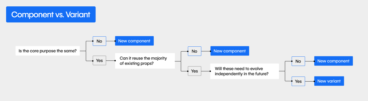
Drawing these boundaries clearly between purpose, structure, and style makes systems far easier to reason about. Teams can introduce new variants without redefining the component itself, or refine styling without altering intent. The component remains stable in meaning, while its variants flex to meet different needs.
This thinking underpins the componentized systems Code & Wander designs and builds, as well as the internal framework our team uses to help organizations scale with confidence. The goal is not to create the perfect component on day one, but to create components whose purpose is durable and whose variants can evolve gracefully as requirements change.
The real scaling problem: variants, not components
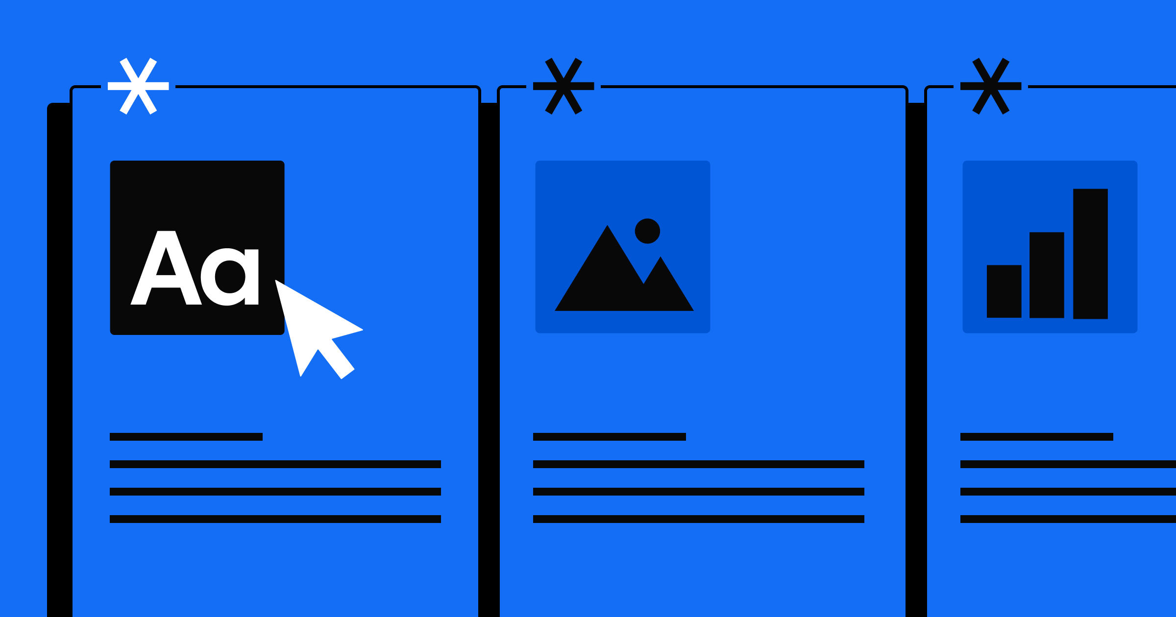
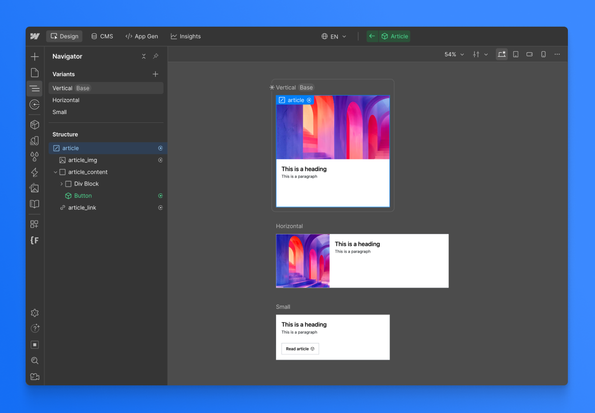
A variant, to recap, is a purposeful variation of a component that maintains the same underlying intent but adapts its structure or style to suit a specific context. For example, below we have three variations of an article card. All of these have the same purpose: show the article. However, the layout and elements vary depending on where the card might appear.
Most system complexity does not come from the base component — it comes from the variants and edge cases that accumulate over time.
A card component might begin with a single layout. Soon, it needs an optional image, then a version without an image, then a version with a badge, then a simplified version for smaller contexts. Each variation is individually reasonable, but together they create a web of conditional logic that becomes hard to track.
Without a dedicated canvas-style view, teams end up managing these variants indirectly through page instances, which makes it harder to spot differences between them. One page uses one version, another page uses a slightly different configuration, and a third introduces a one-off adjustment. The component technically still exists, but its true shape is now spread across the site.
This is what leads to drift, duplication, and hesitation to make changes. When no one can easily see all the variations together, it becomes difficult to answer a simple question: what is the component, really?


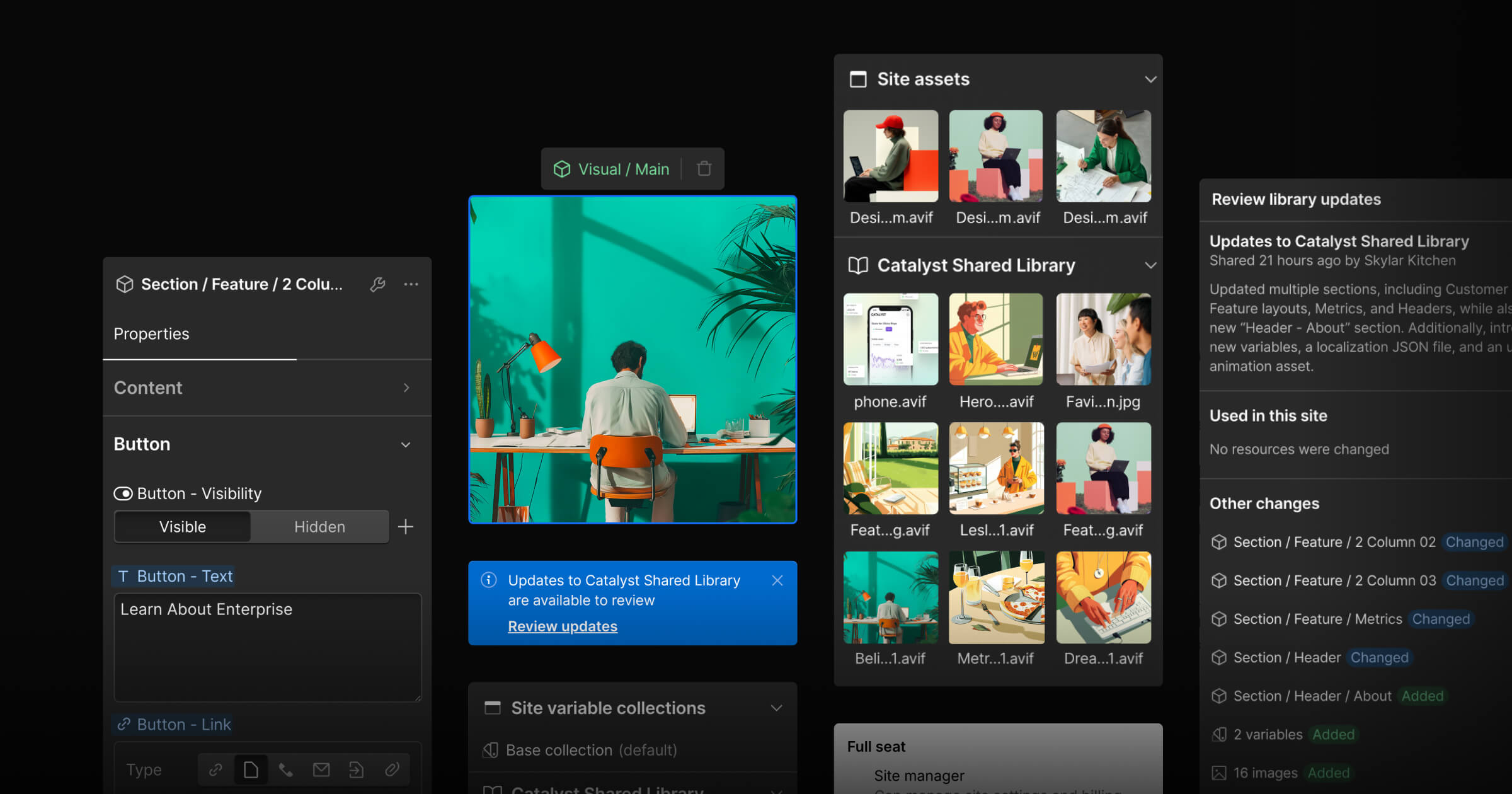
Managing component variants with Component Canvas
Webflow’s Component Canvas is less about visual convenience and more about system clarity. It’s a dedicated authoring space that externalizes the mental model of a component — turning what was previously implicit and scattered across pages into something explicit and inspectable in one place.
This changes the level at which decisions are made. Teams no longer have to ask how a component looks on one page; they ask how it behaves across the entire system. That shift matters most once components move beyond simple static blocks. As soon as optional fields, conditional elements, or multiple content structures are introduced, the ability to see variants and states side by side — and reason about how they behave across the entire system — becomes essential.
Component Canvas has transformed how our team at Code & Wander thinks about variant management. Below are a few core shifts that emerged in the process of integrating it into our daily workflows.
Review cascading changes in one place
Instead of updating multiple page instances and hoping nothing breaks, teams make a single change and immediately understand its ripple effects.
Our team uses the canvas to evaluate structural and styling changes across every variant at once. Seeing the ripple effects before publishing removes the fear of touching shared components and encourages continuous, incremental improvements rather than large refactors.
Keep one purpose, allow multiple structures
As components mature, they often need to support different content structures or conditional elements. A component might render slightly different markup depending on whether an image is present, a CTA is included, or a specific layout is required. Rather than forcing every scenario into a single rigid HTML structure, the team now defines multiple structural states within the same component. The key is that the component’s purpose remains stable, even if its structure adapts.
With conditional visibility in Webflow, a single component can support these different structures depending on content or context. Component Canvas then makes those states visible side by side, allowing us to see every form the component can take and decide whether a variation still serves the same purpose or signals the need for a new component.
Design at the component level, not the page level
Without a canvas, teams often jump between pages to understand how a component behaves. Working directly in the canvas keeps us at the right level of abstraction. Instead of optimizing individual instances, we can refine the component itself.
Let the system document itself
Traditional style guides often attempt to document all component variations, but they quickly become outdated as the system evolves. Every new variant or structural adjustment requires manual updates to documentation, which rarely keeps pace with real-world changes. A live canvas effectively becomes a dynamic style guide that documents itself, showing all current variations in one place without the need to manually record each addition or change.
We use the canvas to train new contributors to understand the system and provide existing team members with greater visibility into ongoing changes.
From weeks to hours: how a component system accelerated Pion
As organizations grow, so do their sites and, inevitably, their components.
When Code & Wander partnered with Pion, a fast-growing team running frequent landing page experiments, we introduced a structured component system that fundamentally changed their velocity. As Max Dunne shared in our webinar on Building for Scale, adopting the system drove a “hockey stick” improvement in efficiency — what once took weeks to design, build, and launch could now be achieved in a matter of hours.
“Historically, campaigns would have to be briefed in four weeks ahead of schedule, now we can do that in a day with little to no design support. A 24 hour turnaround for a campaign is absolutely unbelievable.” — Max Dunne, Global Head of Design at Pion
The difference was not just speed, but confidence. With a clear source of truth and well-defined components, multiple contributors could work in parallel without questioning whether what they built would stay on-brand or require additional designer oversight. Instead of rebuilding similar sections for every campaign, the team composed pages from trusted components designed to flex within defined boundaries.
Components stopped being fragile fragments and became reliable building blocks. That shift allowed the team to focus on experimentation and growth, rather than wrestling with inconsistencies or rework. The system did not slow creativity down — it amplified it.
Design for change, not perfection
Design systems are never finished. They are constantly shaped by new requirements, new content types, and new contributors. Component Canvas supports this reality by encouraging iteration rather than rigidity. Instead of freezing components in an idealized state, teams can evolve them gradually while maintaining clarity about their purpose and behavior.
The most resilient systems are not those that attempt to predict every future need, but those that optimize for clarity and evolution. When components are easy to inspect, reason about, and adjust, teams can move faster without sacrificing consistency.
Component Canvas helps teams treat components as long-lived, evolving assets. And that shift — from static building blocks to living parts of a system — is what allows design systems to truly scale. As teams grow and landing pages multiply, a well-structured component system becomes an efficiency multiplier, turning weeks of work into hours while preserving consistency.